Nest thermostat data plot using shiny dashboard
This article will demonstrate the process of making a simple shiny dashboard and plotting the data from csv file.
At the end of of the article i will also describe how to deploy the application on shinyapps.io.
Shiny apps and dasboards are using R language and they are fairly simple to make after you tackle the basis and understand the structure.
The application, i will be demonstrating here today is for plotting the data from the Nest thermostat. The Google provides you the data at Google Takeout, you can just download it from there (instructions how to do it are in the help section of the application). However the Google doesnt provide any platform where you can see your data on chart, except in the Nest app, where things are really small and you cant see much of the detail and that didnt satisfy me, you could probably feed it to Google Data Studio but i decided to take different step and make my own plots using R language.
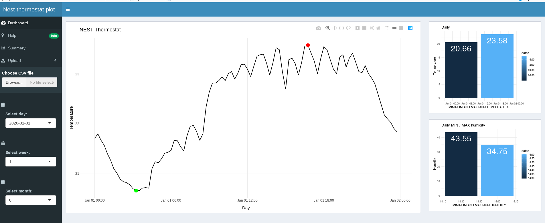
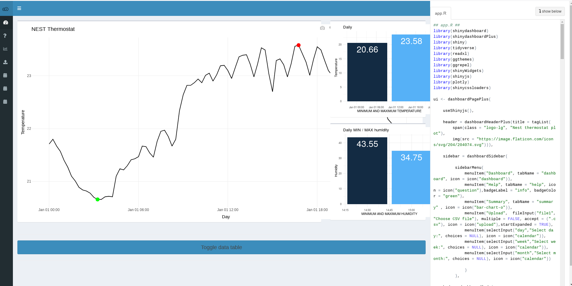
Here is the example of Daily view of data from csv file. Main plot in the middle and on the right side, there is two smaller info charts of minimum and maximum temperature and humidity.
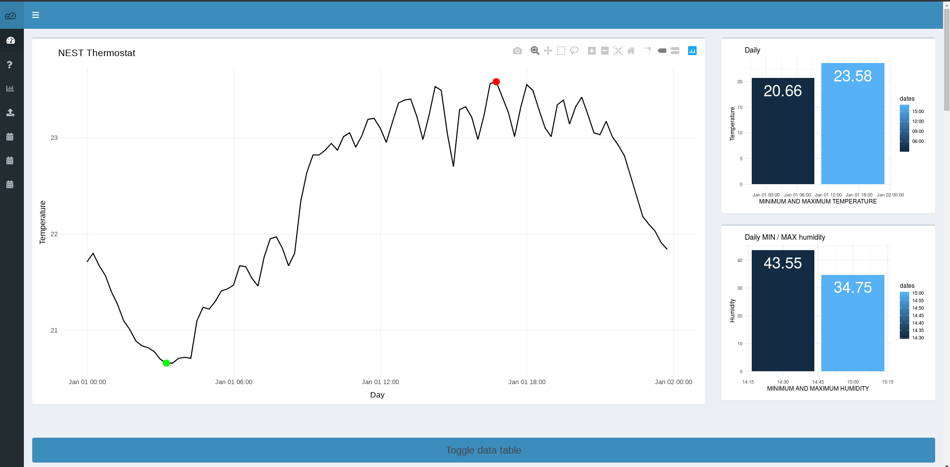
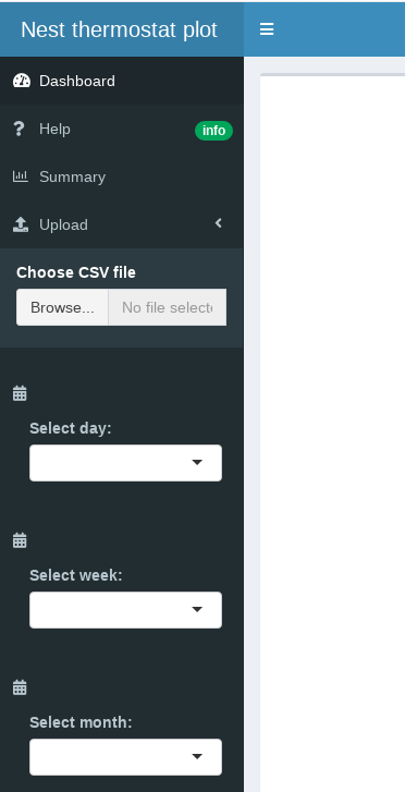
It has semi expandable side panel, where you can upload your file and change time periods between daily,weekly and monthly.
Building the app
The best is, in my opinion to start with simple base and keep adding the features and test as you go. Here is a base dashboard example:
## app.R ##
library(shiny)
library(shinydashboard)

ui <- dashboardPage(
  dashboardHeader(),
  dashboardSidebar(),
  dashboardBody()
)

server <- function(input, output) { }

shinyApp(ui, server)
If you dont have R Studio on your PC and you want to try this code, you can sign up for free account at R Studio Cloud, sign up with Google acct and you set in seconds.
Then you can copy the code snippet and run this example. This code produces just empty dashboard.
Now we start adding things. We add items to the sidebarpanel and then content to the main dashboard body. In my case i have used shinydashboardPlus
Lets look at the sidebar panel:
 sidebar = dashboardSidebar(

         sidebarMenu(
             menuItem("Dashboard", tabName = "dashboard", icon = icon("dashboard")),
             menuItem("Help", tabName = "help", icon = icon("question"),badgeLabel = "info", badgeColor = "green"),
             menuItem("Summary", tabName = "summary" , icon = icon("bar-chart-o")),
             menuItem("Upload",  fileInput("file1", "Choose CSV file"), multiple = FALSE, accept = (".csv"),
                      icon = icon("upload"),startExpanded = TRUE),
             menuItem(selectInput("day","Select day:", choices = NULL), icon = icon("calendar")),
             menuItem(selectInput("week","Select week:", choices = NULL), icon = icon("calendar")),
             menuItem(selectInput("month","Select month:", choices = NULL), icon = icon("calendar"))

             )
         )
You just add things you need in menuItem() and that creates the single item menu, then you add whatever you need in menuItem(), ie. icon,badge etc… the dashboardSidebar() is within the dashboardPagePlus().
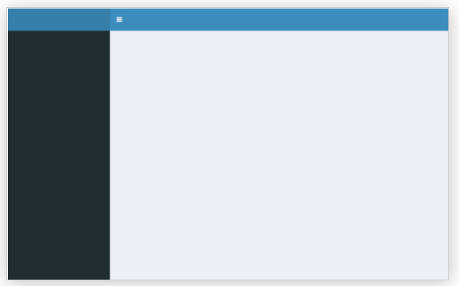
The code above adds sidebar panel to the empty dashboard :
Lets add things to dashboarddBody(), by creating tabItem() inside of tabItems() :
body = dashboardBody(

        # Boxes need to be put in a row (or column)
        tabItems(
            # First tab content
            tabItem(tabName = "dashboard",

                    fluidRow(
                        box(plotlyOutput("chart2", height = 650) %>% withSpinner(type = "5"), width = 9),

                        box(plotOutput("chart3", height = 300), width = 3),

                        box(plotOutput("chart4", height = 300), width = 3)

                    )
              )
        )
  )
This code will add 3 boxes in the body where we output the plots, we put those inside fluidRow(), one big box and two small ones on side, Then for each menuItem(), we create its own tabItem(), it will look like this:
Below these boxes we will output the data table and make it toggable with the button :
fluidRow((column(12, actionButton("tog","Toggle data table", class = "btn btn-primary btn-lg btn-block")))),

fluidRow(tableOutput('table1'))
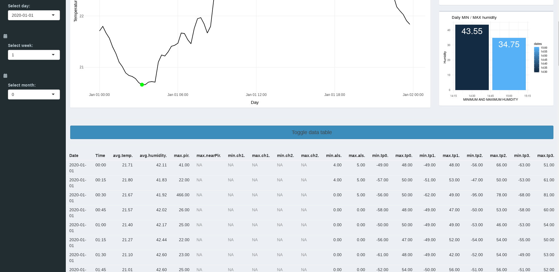
Notice that shinydashboard uses the bootstrap and you can use elements from bootstrap with their original class. We are using this long streched button.
class = "btn btn-primary btn-lg btn-block"
After this we are done with basics of ui part of application and we can write the server code.
First we need to load the data, we have to check wheter user uploaded some or not, if not we will load our dataset, we do all that in shiny reactive enviroment
#load data

    df <- reactive({

        inFile <- input$file1

        if (is.null(input$file1)) {

        inFile <- read.csv("2020-01-sensors.csv",  stringsAsFactors=FALSE)

        }

        else{
            read.csv(inFile$datapath, stringsAsFactors=FALSE)
        }
Ater we have data loaded, we can now do aggregations and proccesing we need.
#process dataframe
    nest <- reactive({
        df() %>% mutate(dates= as.POSIXct(paste(nst()$Date,Time)), days= nst()$Date) %>%
        select(dates,avg.temp., days, avg.humidity.) %>%
        rename(temp=avg.temp., humidity=avg.humidity.)
    }
We need to observe the inputs and update if input changes:
observeEvent(input$day, {

        day_selected <- input$day

        nestf <- nest() %>% filter(days==day_selected)

        output$chart2 <- renderPlotly(ggplot(nestf, aes(x=dates, y=temp))+ geom_line()+
        ylab("Temperature")+ xlab("Day")+ggtitle("NEST Thermostat")+theme_minimal())

  }
We will also need to observe the button to toggle table:
#Toggle table data

    observeEvent(input$tog, {

        toggle("table1")

    })
And thats it,
the base application is finished, now we just deploy to shinyapps.io, which is really easy if you created app on Rstudio cloud, its going to work same way as it works in your Rstudio cloud project, just press the blue publish button, connect your shinyapps.io account and publish the app.
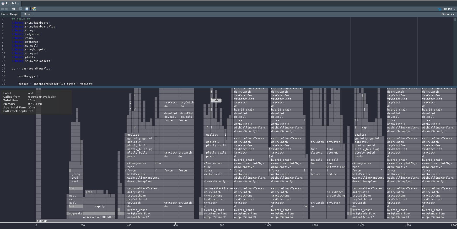
Now we can look if we can optimize it and give it final design touch. You can use profvis to see how your app is doing:
library(profvis)

profvis(runApp("nest"))
profvis will generate report, where you can see if anything is slowing down the things which you could possibly optimize
You can also look at your app side by side with executing code with:
shiny::runApp("nest",display.mode="showcase")
You can look at the app at https://p1463k.shinyapps.io/nest-plot/